Visualizing Variable Distributions
Reading
Sections 1.6.3, 1.7.1, 1.7.4, 1.7.5
Practice Problems
- 1.9.7 (Page 71)
- 1.65, 1.66
Notes
For every variable we talk about the variable’s distribution, which means a description of what values the variable takes, and how frequently it takes those values. Variables are visualized differently depending on their type.
Visualizing Categorical Variables
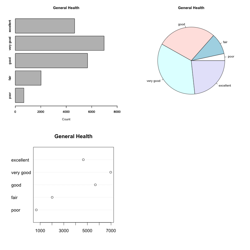
- Frequency Table
- A table showing each possible value, along with its frequency i.e. the count of its occurencies. One can also include relative frequencies.
- Pie Chart
- A circular shape is divided in parts proportional to the relative frequency of each value. Good for showing relation of each part to total.
- Bar Chart
- A rectangular bar for each value, whose height is proportional to the frequency. Good for comparing frequencies of values to each other.
- Pareto Chart
- A bar chart where the values have been ordered from most frequent to least frequent.
| poor |
677 |
3.385% |
| fair |
2019 |
10.095% |
| good |
5675 |
28.375% |
| very good |
6972 |
34.860% |
| excellent |
4657 |
23.285% |
Activity: Looking at these graphs and the table, decide for each of the following statements which graph best exemplifies it (makes it easier to notice):
- Approximately 1 in 4 people answered “good” for their health level.
- More people answered “good” than those that answered “excellent”.
- The difference in count between “fair” and “poor” is about the same as that between “good” and “very good”.
- There are around 3 times more people who said “good” than those who said “fair”.
- About 10% of the population answered “poor”.
- About 1 in 3 people answered “very good”.
Visualizing Scalar Variables
Visualizing scalar variables is more challenging. There are too many individual values to consider and just presenting each value is not all that helpful. For instance telling someone exactly how many respondents have a height of 62 inches, exactly how many are at 63 inches and so on is overwhelming and not really helpful in terms of establishing trends. We need ways to organize the information into more digestible nuggets.
Here are some of the standard tools for visualizing quantitative information.
- Summaries
- Numerical summaries can give us some limited but easy-to-work-with information. Frequency tables turn out to be too unwieldy in this case. We will see a number of these summaries, including the mean, median, standard deviation, and others.
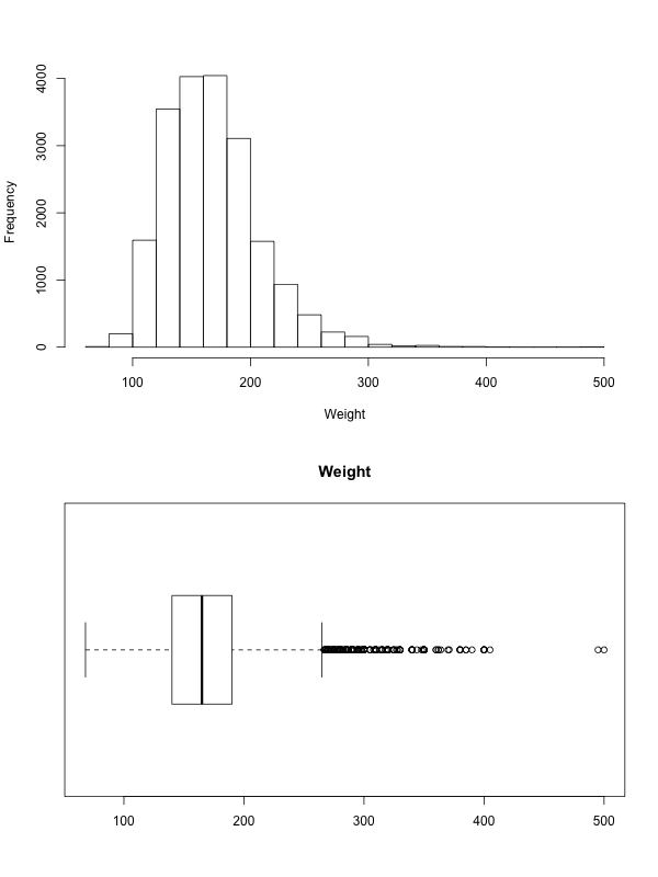
- Histogram
- Values are broken into equally spaced intervals. Draw one bar per interval whose height is proportional to the frequency of values in that range.
- Stem-Leaf Plot
- Useful for certain types of values. Use first 1-2 digits for “stem”, then add one value via its “leaf” on the correct stem row.
- Box-plot
- Visual representation of the “five number summary” that we will talk about later.
- Density plot
- A continuous line that describes the data a bit like a histogram, only more precisely. We will not be using them in this course, but they are out there and are useful.
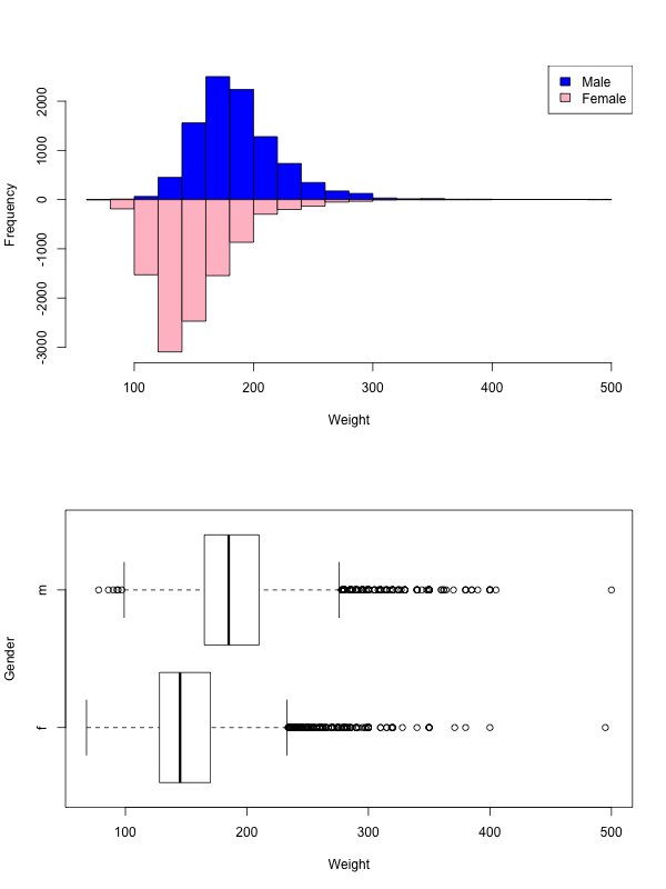
We often consider the values of a quantitative variable separately for each category defined by a categorical variable, and in this case variants of the above graphs can help.
When visualizing scalar variables, there is some terminology we use and patterns we look for:
- Mode
- A mode refers to a distinct section of the data that “stands out” as a spike in the graph. It need not be a single value, more of a tendency for values to concentrate around that point. A graph with a single mode is called unimodal, one with two modes is called bimodal. When multiple modes are present, they become the main characteristic of the dataset.
- Tail
- A term referring to the two ends of the data. A long tail indicates that the data on that side is spread out and “goes on for a while”.
- Skewness
A skewed left distribution is one where the left tail is longer. This represents a concentration of data (higher bars) to the right.
A skewed right distribution is one where the right tail is longer. This represents a concentration of data (higher bars) to the left.
A symmetric distribution has both tails be about the same. If you look in the middle of a symmetric distribution, then the two sides around the middle should be (close to) mirror images of each other.
- Outliers
- Any values that seem to deviate from the overall pattern are called outliers. Some times these are simply values that are too far from the rest. But some times they can be outliers for other reasons.
- Look for reasons
- Whenever you consider a feature, always look for an explanation for it. Is there good reason why the distribution is skewed right? What are those outliers, do they make sense?
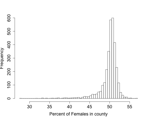
Example: County Data
The following graph contains one data-point for each county in the US. The value is the percent of female population in that county. Discuss the pattern of the distribution, and provide possible explanations.
- What is the overall pattern? Does that make sense?
- Do the average/typical values make sense?
- Are there deviations from the pattern? What might explain them?
- What further questions might we want to ask? What would we need to do in order to get answers?
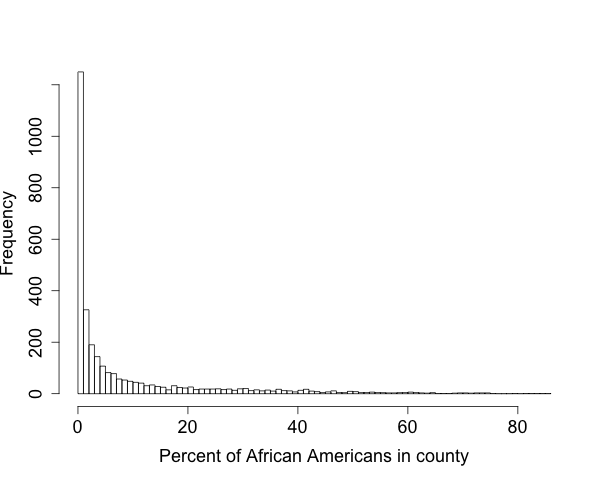
The following is a graph of the percent of african american population in the state. Answer the same questions.
- What is the overall pattern? Does that make sense?
- Do the average/typical values make sense?
- Are there deviations from the pattern? What might explain them?
- Why does this graph differ from the previous?
- What further questions might we want to ask? What would we need to do in order to get answers?