Example of a Scatterplot
Section 7.1.4
Scatterplots visually display the relationship between two quantitative/scalar variables.
One of the first things we want to do is describe the relationship seen in the graph:
Are there multiple clusters? A “cluster” is a group of points that exhibit a common behavior. They do not have to be near each other, but they do have to share a pattern.
If there are multiple clusters, we usually describe each separately, as far as the following items are concerned.
Let us look at an example:

Example of a Scatterplot
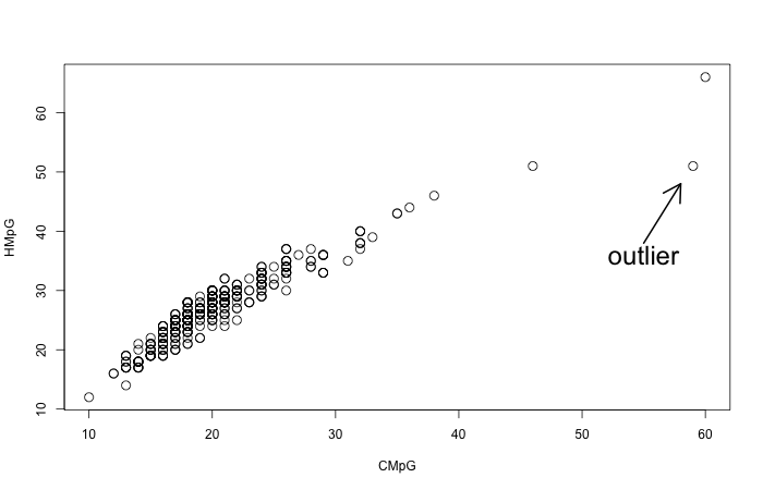
This is an image of the relation between city mileage and highway mileage for various car types.
We notice a single cluster, with an overall positive direction, pretty close to linear form. This makes sense to some extent: Some cars are more efficient than others, so they will have better performance both in city and highway.
And in general we don’t expect a car to be much more efficient on the highway but not as much more efficient in the city, hence the linear form.
The strength of the relation is that the relation appears to be fairly strong, as the points stay relatively close to the linear direction. There is one very marked outlier: A car that is doing extremely well in the city, with a very high CMpG, but its highway mileage, while very good, is not just as good.
There are two more cars that are “far from the pack”, but I would not classify them as outliers as they are still part of the linear pattern, just a bit further ahead from the rest.
Let us look at another example:

Another example of a Scatterplot
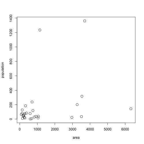
This example shows the relationship between a country’s population and its land mass. See if you can identify the various outliers.
Overall here we can’t really talk about a pattern. There are some interesting outliers:
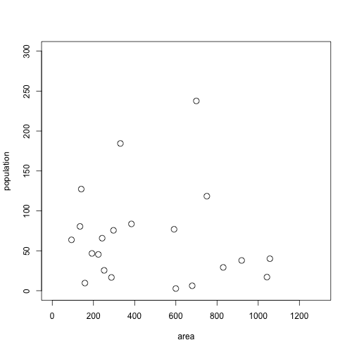
Overall not much of a pattern. We could look for a pattern by “zooming in” on the bottom left of the graph:

A zoomed-in version
Even in this zoomed-in version we do not see much of a pattern going on. Overall we can conclude that there is not much of a relationship between a country’s area and its population.
The correlation coefficient is a specific number, denoted by \(r\), that we compute from our data.
It is only appropriate to use for linear relationships without too many outliers.
In that case it can measure the strength and direction of the linear relationship.
Some key facts about the correlation coefficient, before we look at its computation:
For example, our mileage example earlier has an \(r = 0.94\), while the population example has an \(r=0.306\), which is typical of a very weak positive correlation.
If we “zoom in” on the lower left part of that graph, we find a correlation of \(r = -0.0856\), practically 0.
Now we describe the computation. First the formula:
\[r = \frac{1}{n-1}\sum \left(\frac{x-\bar x}{s_x}\right)\left(\frac{y-\bar y}{s_y}\right)\]
Basically:
The idea behind this is as follows: