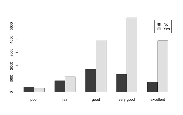
Example of a clustered bar chart
When we have two variables measured on the same individuals, we can ask how they interact with each other:
We say that the two variables \(x\), \(y\) are associated, or related, if certain values of the one variable tend to appear with particular values of the other variable.
For instance, height and weight tend to be related, as taller people will also tend to have more weight. This does not mean that there are no shorter people with more weight than one might expect, just that there is a certain trend.
As another example, suppose 60% of female students are in greek life, while only 45% of male students are in greek life. Then we could say that the variables “Greek Status” and “Gender” are associated, since the “Female” value of the “Gender” variable tends to show a higher preference for being paired with the “Greek” value of the “Greek Status” variable than the “Male” value of the “Gender” variable does.
In general, depending on the types of the three variables, we use different means to determine whether they are related or not.
Let us consider the problem of comparing two categorical variables. A convenient way to arrange the information is by a two-dimensional table, often call a “cross-tabulation”. It shows us how many cases fall in each combination of values from the two categories. For example, the following is a cross-tabulation between the variables “exercise” and “general health” that asked people if they exercised in the last month and how they would describe their overall health.
| exercise | poor | fair | good | very good | excellent | Total |
|---|---|---|---|---|---|---|
| No | 384 | 857 | 1731 | 1352 | 762 | 5086 |
| Yes | 293 | 1162 | 3944 | 5620 | 3895 | 14914 |
| Total | 677 | 2019 | 5675 | 6972 | 4657 | 20000 |
For example we can see in this table that there were a total of 1731 respondents who said they considered their general health to be “good” and also did not exercise in the last month (“No”).
Graphically we can represent the same information via a clustered bar chart:

Example of a clustered bar chart
The key question we want to ask is this:
Is it the case, that those who exercised in the last month tend to perceive themselves as in better health?
Does the table above, or the clustered bar chart, help us answer this question? The answer is “not really”. For example we can see that almost all the numbers in the “Yes” column are bigger than the corresponding numbers in the “No” column, but that does not mean anything as there are in general more Yes answers than No answers. The real question is this:
Do the “Yes” answers tend to gravitate more towards the “good or above” health values, more so than the “No” values?
To answer this, we need the percent of “Yes” answers that are actually in the “good or above” entries, and compare that to the “No” answers that are in the “good or above” entries.
In terms of a table, we can answer this via a table that contains “row percentages” in this case:
| exercise | poor | fair | good | very good | excellent |
|---|---|---|---|---|---|
| No | 7.6 | 16.9 | 34.0 | 26.6 | 15.0 |
| Yes | 2.0 | 7.8 | 26.4 | 37.7 | 26.1 |
Here is the same data in a stacked-bar-chart form:
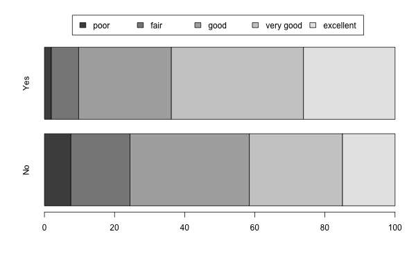
Example of a Stacked Bar Graph
Looking at either the table or the graph, we can see that a higher percentage of the “Yes” answers comes from the “very good” and “excellent” categories, compared to the percentages for the “No” answers.
Those that had exercised in the last month were more likely to describe their health as “very good” or “excellent” than those who did not exercise.
We can go further, and decide to break the plot in two, separately for males and for females:
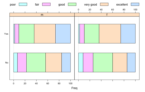
Example of a Stacked Bar Graph with Panel Variable
This would allow us to answer “Is the relation between exercise and perceived general health different for men and for women?”. If that were the case, then the bar graphs on each panel would exhibit some different behavior. This does not seem to be the case.
There are always two ways to look at a stacked bar chart, depending on what kinds of percentages we compute, “row” or column. We could have computed column percentages:
| exerany | poor | fair | good | very good | excellent |
|---|---|---|---|---|---|
| No | 56.7 | 42.4 | 30.5 | 19.4 | 16.4 |
| Yes | 43.3 | 57.6 | 69.5 | 80.6 | 83.6 |
These percentages mean something different. For instance the \(80.6\) tells us that \(80\%\) of the respondents who described their health as “very good” said they exercise. These numbers will not help us reach the previous conclusion. All these numbers say, effectively, is that there are more people who exercise. The fact the percentage of “Yes” values does increase as we move towards the “excellent” group does hint at our desired conclusion, but in general this way of aligning the data does not make our case very well.
Choose which variable you will place where in a stacked bar chart. Ask yourself which percentages you want to be able to read. Percentages within one bar always add up to \(100\%\).
When comparing categorical and scalar variables, a good first step is a boxplot:
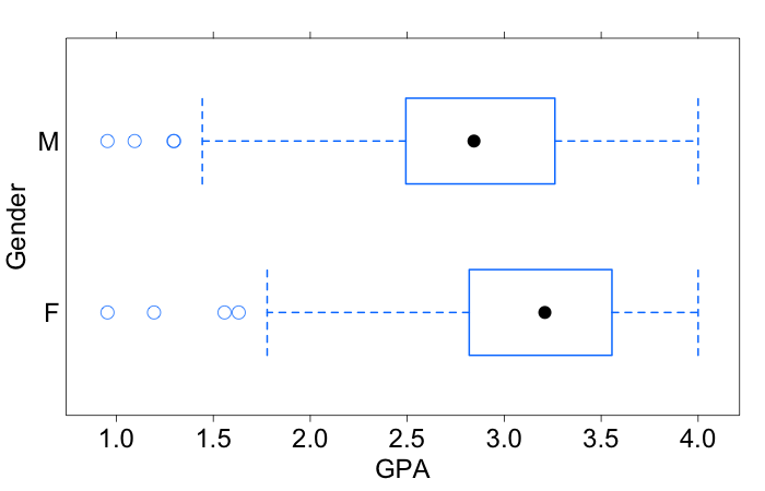
Example of a Boxplot
This compares the gender of Hanover students against their GPAs. What we can see here is that even though both sets of students have a wide range of values, the GPAs for female students tend to concentrate a bit higher than the GPAs for the male students. In fact the medians are about 0.3 units apart. So there appears to be some relation between a student’s gender and their GPA.
Even though this difference might appear to be small, it comes from fairly large samples, which tends to make it more considerable. We will discuss these issues more extensively later.
Along with the boxplot, some numerical summaries are helpful:
| Gender | Q1 | Median | Q3 | IQR | Mean | Std. dev. |
|---|---|---|---|---|---|---|
| Female Male | 2.82 2.49 | 3.21 2.84 | 3.56 3.26 | 0.735 0.768 | 3.15 2.86 | 0.511 0.554 |
We will discuss this extensively in the next section.